How to create a mobile app design that truly resonates
Today’s technology gives us access to devices with extremely high resolution and amazing display capabilities. However, not all devices (or all users) are created equally. In other words, with great resolution comes great responsibility. Here’s how to create compelling mobile app design despite all the bells and whistles.
Don’t squeeze as much as possible onto the screen
When designing for high-res displays, there may be a desire to push the limits of size and spacing of interactive elements. In other words, you might be tempted to squeeze a ton of functionality into a single screen. But don’t get carried away–fingers aren’t as precise as mouse-based cursors. If users miss a too-tiny touch zone, they may think that it is not actually a control after all. End result: the user exits stage left frustrated and confused. When considering the appropriate size of touch zones for interactive elements, think about who will be using the app. For example, if you are creating a mobile app design for young children, their finger size is much smaller. However, you might need to create a larger target zone for tapping, because their fine motor skills might not be developed.
Don’t use small font sizes and hard-to-see colors
High resolution displays can support small fonts and fine details, but resist. Just because your device can graphically support a clear rendering of a 4-point font does not mean your users want it. The text size, graphic details, and color choices should fit your app audience’s unique needs. Again, it’s really important here to consider who will be using your apps. If you are designing a dating app for seniors, you’ll want to pick different visuals than an app targeting high school baseball players.
Aim to add fine graphic details and extra text only when it adds value. Does the extra detail aid in the users’ understanding of an icon, make navigation clearer, or reduce scan time? If so, congrats! You’ve made an easy-to-use mobile app.
Don’t overwhelm users with information
We all know about brain freeze, right? Eating too much ice cream way too fast – brain freeze! Well, you can also get a sort of brain freeze when you’re hit with too much information too quickly. With high-res displays, avoid the urge to overwhelm the user with too much information all at once. The thinking may go something like this: More Info on One Screen = Fewer Screens = Better Experience. However, going this route may actually have the opposite effect. Bogging down the user on a content-heavy screen will make the user’s experience less efficient and less enjoyable. Again, the end result is user exiting stage left to find the next app on the list.
Create unique, attractive icons
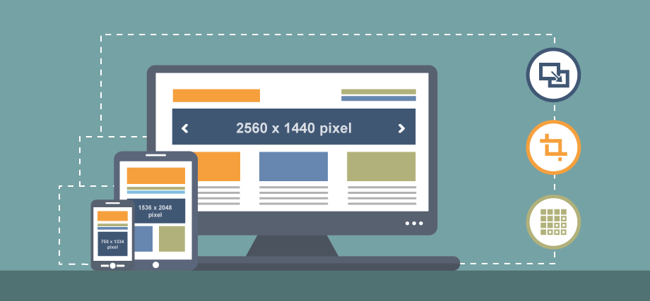
When you’re designing your mobile app, you want to establish a good sense of the range of devices on which it will likely be used. Make sure that your app display does not get lost in translation when being rendered on a lower resolution device – not everyone is on a Retina display yet. Device canvases vary greatly between high and low resolutions and between mobile phone and tablet platforms. Make sure you are able to appropriately scale your design for the full range of devices that will be used. That way, you will not alienate any segments of your market.
It’s important to get your mobile app design to stand out in the vast wilderness of the app store. To do it, take an extra second to consider the available display capabilities, as well as your users’ unique capabilities and limitations. There are a lot of choices available in the app store, so please design responsibly when going high res!
Get high-quality mobile app design with Red Letter Marketing
Thinking about a new mobile app for your business? We can help. Learn more about our mobile app development team or contact us with any questions you may have about the app design and development process.


