For our four-year anniversary, we bought ourselves a new logo.
And yes, “bought” is the correct verb. We’re paying for our new logo in both man hours and legal tender—so it is not an idle decision we made on the spur of our third flute of anniversary champagne.
Was there something seriously wrong with our old logo?
Heavens no! I’m surprised you even asked—although to be fair, it was me who asked, not you. At the launch of Red Letter Marketing, our logo possessed all the qualities we value in a corporate mark.
Take a gander. It’s still a beauty:
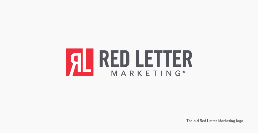
That logo embodies the classic simplicity that stands the test of time. We strive to design logos that are beyond mere trendiness, and this one is the polar opposite of “flavor of the month.” The mark is elegant but maybe also impertinent, with that cheeky reversed “R.” We like the timeless perfection of the square, and the ease with which that part of the logo can be used by itself, without the logotype. Just the red mark in the upper left of a page declares itself quietly but confidently.
So, why change it?
Again with the questions. While there were no serious problems with our logo—which, by the way, looked great in frosting form on the cakes we give to new clients—there was one small thing that kept our esteemed president, Kelly Gomez, in a state of cognitive dissonance.
It was the absence of the letter “M.”
Among Kelly’s talents is a prodigious ability in the area of mathematics. She astutely noted that our name is composed of three words: 1) Red; 2) Letter; 3) Marketing. The mark had but two initials: 1) R; 2) L.
Kelly knows—better than most!—that 3 ≠ 2.
All of us—including Kelly—are aware that a new logo design is not an SAT exam. We can loosen the rules of arithmetic in the service of art. Also, our love for the design overrode any numerical quibbles.
And yet . . . .
A few wondered whether perception of the mark might be complicated by an uninvited association with Ralph Lauren.
Objections such as these arise during the design of any new logo. If you ponder a design long enough, you will conceive possible objections. One of our most valuable services to clients is using our experience to clarify the distinction between valid concerns and the infinite number of micro-quibbles that should be filed away in the “overthink” folder.
On the other hand, if you’re still mulling your so-called micro-quibble four years later, maybe it’s time to upgrade it to macro.
Our lead designer, Olaf, took up the challenge of redesigning our mark. He retired to his design cave to sketch out some ideas. He presented us with these results of his exploration:
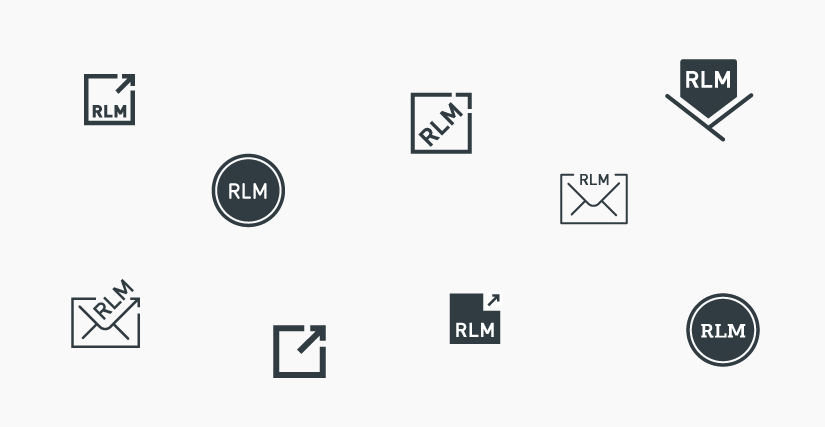
While we all liked these logos, Olaf would not take yes for an answer. Before we could sit down to decide which we wanted to choose for further development, Olaf disappeared in a cloud of cartoon smoke. Back to the design cave!
When he emerged, he presented us with this:
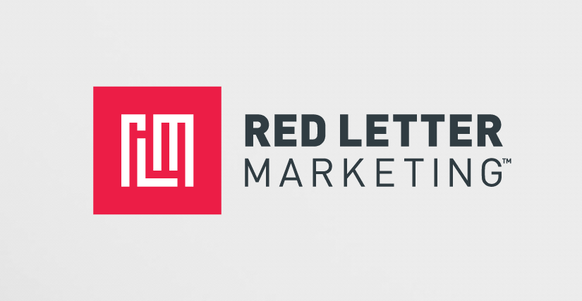
I think I’ve said enough. The new logo itself is more eloquent.
