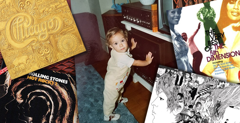
Our ACD, David Deasy, recalls the first stirrings of his passion.
It all started with his parent’s record collection.
In the late 70s and early 80s, I could often be found in the family den where my father kept his abundant collection of vinyl record albums. In that same room was his Garrard turntable and a Kenwood amplifier. The Pioneer speakers my Dad brought back from Hong Kong after his Vietnam War naval tour were in the living room. This setup filled our home with sounds and melodies—often jazz-infused rock—that captured the spirit of the time. In that house I was immersed in this music, all the time.
It was in my dad’s den that I made a life-changing discovery of the visual complement to the sounds I was learning to love. I became enchanted by the artwork on vinyl record sleeves.
Thanks to the accessibility of my parents’ record collection, I was able to lose myself in a profusion of visual interpretations of the music I was hearing. My dad’s collection was lined upright on shelves, with the spines facing out. I would get up close and slowly pass my little fingers across the spines. At a certain point I’d make a spontaneous selection and pull the record out to see what was on the cover.
These albums represented my parents’ life beyond myself, which was hard to comprehend at the time. They were like slices of the lives that brought me into existence. The colorful pictures on the sleeves drew me in. Gradually, I fell under the spell of these magical 12.5” x 12.5” card-stock sleeves—entranced by the illustrations, the type, and the photography.
I think what sparked my imagination all those years ago was the perception that there was a world beyond the small town I grew up in. I sensed a world of brilliant personalities who had something to say through music, and through the enthralling art that accompanied it—images that you could hold in your hand and gaze at, as your imagination roamed.
The album artwork seemed to capture the spirit of the music, and therefore the artists. Of course I couldn’t articulate my experience at the time, but the gathering realization that visual art could complement and express an artist’s music, was—and remains—fascinating.
I remember one series of album covers—for the group Chicago—that especially grabbed my attention. This was the era of album covers as art, and there were memorable examples everywhere. Every notable band—The Rolling Stones, The Beatles, 3 Dog Night, the 5th Dimension—had expressive, often iconic album covers, because the best designers wanted to work with those bands.
Chicago’s covers were among the great works of the time—but there was something about them in particular that I noticed, even at that young age. Every Chicago album cover presented as the dominant graphic the band’s elegant logo—beautiful, custom-designed letterforms. Every release featured this design in the center of the cover, but each time it was rendered differently—including (for the album Chicago VII) as a gorgeously tactile emboss. Eight-year-old mind: blown.
What I noticed was the symbiotic relationship between the art and the music. The organic flow of the Chicago logo’s swashes were born (it seemed to me) from the band’s distinctive horns swirling in and out among guitar, keyboard, flute and vocals. I imagined the letterforms appearing magically on the walls of the studio as Chicago’s multilayered arrangements filled the space during a recording session.
These great album covers didn’t just happen, of course. There was a designer behind the work, as I learned later, after I realized I wanted to work in this field. Credit goes to John Berg, who also designed album covers for Bob Dylan, Sly and the Family Stone, Santana, and many others. He must have spent some time in the family den as well.


