We stood the heat.
We stayed in the kitchen.
We cooked up something awesome.
Marsh Kitchens offers kitchen renovation services, presenting their best ideas in five inviting showrooms across North Carolina. But people don’t just drop by kitchen exhibitions. A kitchen renovation is not a spontaneous decision. Consequently, Marsh Kitchens’ website is crucial to getting customers to make the transition from “idle web-surfing dreamer” to “committed renovator, ready to buy.”
THE SITUATION
The Marsh Kitchens website displays dazzling photos of dream kitchens. But pictures can only go so far in attracting the attention of the almighty Google. Our goal was to get casually curious, kitchen-challenged web skimmers to find their way to our site—whether intentionally or not—and get a gander at these fabulous spaces. But the site needed some serious help if it was going to start ranking at the top of organic search results.
THE SOLUTION
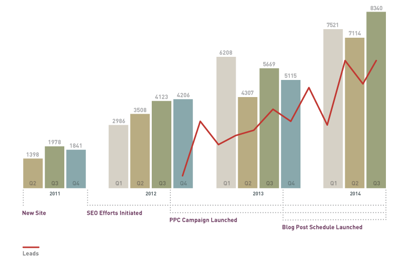
We started with an SEO overhaul, reorganizing content and rewriting to be more Google-friendly. We altered the architecture to more readily prompt customer conversion. In addition, we began tracking leads from the site, in order to establish a baseline and track improvements. Finally, we set up a content production workflow that fed lively new posts to the site on a regular basis. (Our client had occasionally posted to the blog. However, everybody at Marsh who was tasked with writing blog posts had twelve other duties—sometimes thirteen!—that took precedence. So the blog did not get enough fresh new posts to signal to Google that it was worthy of attention.)
We also crafted a series of pay-per-click ads that we deployed in A/B variations for the purpose of testing which messages really motivated. We tracked results and revised our plans as we went along.
THE OUTCOME
Our efforts delivered visitors to both the site and the showrooms. So many more people visited the Marsh site that it’s quite possible that you, dear reader, are one of them. (Have you seen the site? Go now. No, wait. Go after you finish reading this.) Note on the chart below the agreeable upward slant, representing ever-increasing site visits. Note, too, the significant jumps at specific points where our campaign elements were implemented.


